Thursday, May 5, 2011

Stumped!

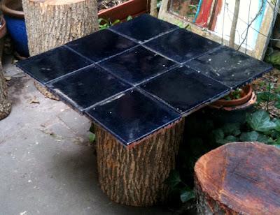
It's garden improvement time! We were able to procure 7 tree stumps from an event Justin worked and they have been sitting in our hallway for months. Well now that the weather has been warming up we have taken to making them into stools for our backyard. Well "making" is maybe the wrong word - more like preparing them.


First step is sanding the tops of the stumps for a nice even, smooth sitting surface.


Next we applied a fast drying polyurathane to the tops and bottoms of the stumps to prevent rot (hopefully!).


Then we decided to make a quick and possibly temporary table to go along with our new stump stools. For the table we used a stump as the pedestal of the table and screwed a square piece of wood on top of it into the stump. Then we laid ceramic tiles on top to create a sturdy surface. We haven't technically adhered the tiles yet, but in time!


And there you have it! Delightful woodland garden seating and a table made from upcycled tree stumps!

Monday, April 4, 2011

Our Zig Zag Wall

Our statement wall is finished! We are now the proud owners of a zig zag patterned wall. And I must say - it was quite easy! Well once you got past the whole taping bit... Here is how I did it:


As I mentioned, the taping part is definitely the most tedious part of this process. To start we measured the width of the wall and then decided how many peaks of the chevrons we wanted to have. We chose 5 and I would always recommend choosing an odd number as odd numbers are more pleasing to the eye. So knowing we wanted 5 peaks we divided the width of our wall into 5 sections and marked it off with a pencil. We then decided we wanted the yellow painted stripes to be 4 inches wide and the white to be 7 inches wide. So starting at the bottom using measuring tape and a level we carefully measured and moved across the wall and then up row after row. Once you have your tape up, clean up the edges on the inside where you will be painting with a straight edge wherever there is overlap. The taping process took maybe 3 hours in total split between a few nights.


Here is the best tip I have ever learned in wall painting - if there is only one thing you ever take away from my blog, it should be this: To prevent paint bleeding under the painters tape, first paint a base coat that matches the wall color. In our case this was a base coat of white where we planned on putting the yellow. Painting the base coat of the wall color insures that if any paint bleeds under the tape, it will match the wall and be unnoticeable. It also makes the top coat at the same level as the tape to again create a very clean line. I used a roller to apply both the white base coat and the top yellow coat. The painting process was much much quicker than the taping!


Now the most fun part of the process.... Peeling the tape! Now it is very very hard to wait for the paint to dry all the way (24 hours) because it is so very tempting to see if all of your hard work turned out how you intended. Especially if you are rather impatient like me - but I have learned this the hard way in the past and I can tell you it pays off to wait to peel! Peel the tape slowly to prevent any of the paint coming off with the tape.


So that's our zig zag wall! I'm quite happy with the way it turned out. I think it really adds movement and interest to the wall while not being too wild (at least not for our tastes). Painting the base coat of white really made the lines turn out perfectly straight - best painting tip ever!


Monday, March 28, 2011

The House of Many Projects


As you can probably tell from my blog, there is always some sort of project going on in our house - and usually multiple ones at the same time! Tonight (after working all day) we decided to start two projects simultaneously - painting a statement wall and refinishing our wood floors. Ok yes. We are probably crazy.


Project 1: Painting a statement wall.
We have been trying to decide for months since moving in what to do with our mostly bare walls in our apartment. I hate a bare wall - any empty square inch on this earth should be filled with beauty! So today I came across a photo of a wall with a zig zag chevron painted design across it and loved the look. I immediately sent the image to Justin and he approved.  Perhaps because we are both impatient, we started taping off the wall right after I got home from work. The finished wall will be a light yellow and white zig zag pattern going from the floor to the ceiling on just one wall.


Project 2: Refinishing the wood floors
The wood floors in our apartment are interesting. In our bedroom they are completely gorgeous with diagonal planks and decorative corners. Some of this pattern continues into the living room but then changes to just straight planks - and a lot of those planks have a significant amount of wear and tear. Although we are renters, we wanted to improve the floors so there aren't big cracks between the planks and pieces sticking up that give us splinters. With the help of our landlord, we are filling in the floor with wood putty, sanding it, staining it, and sealing it. Phew!


With all this action happening in our house on a Monday night, our cat Blue pretty much thinks we are crazy. But he shouldn't be too surprised, this is pretty much a normal Monday night for us!

Updates will come as our projects progress!

Thursday, March 24, 2011

The Royal Wedding Card Set!? Yes... and I made it


As April 29th approaches, it seems like everyone and their mother-in-law is trying to make a buck off of the Royal Wedding of Prince William and Kate Middleton - including my client Topps! I was graced with the opportunity to create the card set and packaging for the Royal Wedding Commemorative Card Collection which will be sold on QVC. Yes... QVC - tell all of your grandmas!

The card set includes tons of photos of Will, Kate, Princess Diana, Prince Harry and Prince Charles throughout the years along with interesting tidbits about their lives and their love story. It will also feature photos from the day of their wedding = manic rush for me on their wedding day to get the new cards to the printer!

Although I do understand the attraction of following the Royal Wedding, I am not going to go as far as calling it the "wedding of the year." I have another wedding in mind a bit closer to me that's going to be just as fabu - although with far less royalty in attendance!

Tuesday, March 22, 2011

Update on our big (messy) project!

Back in January I originally posted about a big project we are undertaking for our wedding - creating an arch for us to get married under out of twirly yarn globes: http://bexcetera.blogspot.com/2011/01/my-next-big-messy-project.html

Well, we finally got around to doing some initial experimenting and I am happy to report: Success!

We followed the instructions on this blog: http://wednesdaycustomdesign.com/blog/messiest-merriest-and-whirliest-diy-balls with a few customizations. Other than the messy factor, this was a super simple project that could be easily replicated by anyone. The finished product could be small and used as a table top decoration, or large to create a freakin' awesome hanging lamp.


Ok, lets get messy!

Balloons, white cotton yarn, scissors, corn starch, school glue, spray oil
We decided to alter the supplies a bit from the original blog. They suggested coating the balloon with petroleum jelly but we thought petroleum = big oil = not eco-friendly = not for our green wedding! So we decided to try spray cooking oil, which ended up working great and seems to be less messy as well.


Blow up a balloon (or 3). Its best to not blow the balloons up to their maximum capacity so that it is rounder. We highly suggest using novelty balloons given to you by eccentric relatives (thanks Uncle Tim!).

Hang the balloons over a tarp or cardboard to protect from dripping glue. Spray down the balloons with the spray cooking oil liberally.


Mix 4 oz. white school glue (one normal size glue bottle) with 1/2 cup corn starch and 1/4 cup warm water with your fingers (dig in!) until there are no clumps. Take one end of the yarn and feed it through the glue mix and then start wrapping the gluey yarn vertically around the balloon until its covered well and then switch to horizontally wrapping. Once your balloon is wrapped to your pleasure, tuck the ends of the yarn under another piece.

Now leave your balloons alone for 24 hours to dry. Note: keep cats away, they will want to ruin your project (probably out of jealousy).


After waiting a day for the yarn to dry... pop your balloon! This part is especially exciting - but also messy as we learned: all of the glue that dried on the balloon flew into the air and all over the balloon popper (me). Then bring your very exciting twirly yarn globes outside to give a coating of clear fast drying spray paint all over your new creation.


Now you have a super fun finished project! That was easy right? Now to figure out how to make these into an arch... hmm...


Things we learned from this experiment:

• The glue mix is only enough for one large balloon or 2 smaller balloons (totally shocked me!). This means we are going to have to buy a giant jug of school glue for our project (yes Justin, you were right and I was wrong).

• Spray cooking oil works well as a substitute to petroleum jelly.

• The mess doesn't end once the glue dries. The dried glue on the balloon goes EVERYWHERE when you pop the balloon.

• We are going to have to buy over-sized balloons to get larger round shapes. The balloon shape really starts to distort and become oblong quickly.

• The finished twirly yarn globes are actually quite strong! This is great news for our future arch.


Wednesday, March 16, 2011

Bexcessories isn't totally gone!


Although I am not currently designing items to sell on my Bexcessories Etsy shop, (hats and hair accessories for the uninitiated) I still am making some items for friends and family. The Etsy shop just ended up being overly time consuming - especially with wedding planning in full swing now! If anyone wants a hat or hair accessory I would still be happy to create it for them - like this hat I made for my lovely Aunt Sandi! I really love the mix of feathers creating an interesting contrast of color and texture on this piece along with the visual interest of the vintage buttons. I also attached the decoration to the hat with velcro so it could be worn in multiple ways!
For any custom Bexcessories request either contact me through this blog or my business email: bexcessories@gmail.com

Tuesday, March 15, 2011

I'm a Fanila!


One of my most fab friends (and the person I am lucky enough to sit by every day at work!) is the gorgeous drag queen Manila Luzon! She is competing in this season of RuPaul's Drag Race, so of course I am a total "Fanila" (fan of Manila!). So to show my support I created some Fanila Art. I have never claimed to be an illustrator, but I think it turned out pretty cute for a quick illustration. This is showing Manila on the most recent episode with a patriotic theme - and whats more American than money!?

Become a Fanila yourself on facebook: http://www.facebook.com/#!/manilaluzonfanpage
And watch episodes of RuPaul's Drag Race on LOGO, VH1 or online at: http://www.logotv.com/shows/rupauls_drag_race/season_3/series.jhtml

Tuesday, March 8, 2011

Complete Fiction


I just received a copy of the most recent book cover I designed that has been published - The Complete Fiction by H.P. Lovecraft. This book is a part of the Barnes & Noble leatherbound collection that I have designed many covers for. I really like the way this cover turned out because it is so different from the others in the collection - mainly in that it is very abstract and modern while the others look like old timey originals. Look for this title and the other leatherbounds at Barnes & Noble - and also look for my name in the front of the book!

Monday, February 28, 2011

Papel Picado Fiesta Flags


I'm a big believer in flags, bunting, and/or signage to really liven a space at a party. For my lovely friend Anja's Mexican inspired birthday brunch I made Papel Picado. The term Papel Picado translates to "punched paper" and Papel picado also describes the traditional folk art used in Mexico to decorate altars, tables, ceilings and plazas during festivals. Papel picado artists use hammer and chisel to punch designs out of stacks of up to forty layers of tissue at a time. 

For a much simpler version, I created the flag design in Illustrator on my computer and printed the flags out in different colors. I cut the border out with scissors - still quite meticulous! - and then folded the top of the paper over and secured it with tape to some twine to hang. I think the end result gives the look and feel, without all the hard work!

Here is a link to download the birthday Papel Picado flag (pictured above) I created to print out for your next fiesta!
https://www.yousendit.com/download/T2pIYURKMGt6RSt4dnc9PQ

Tuesday, February 22, 2011

Keep Calm and Marry On

Photos by Craig Van Blaricum


I love event planning and throwing parties - in fact I could see myself doing that as a job someday if this whole graphic design thing doesn't work out! The latest party I was a part of planning was the engagement party of my good friends Paul and Casey. I posted the invite to the party I created earlier on this blog - the London Underground themed invite. We held the party at a British pub to create as authentic of an environment that we could without having to buy plane tickets for all the guests (a little outside of the budget). To finish the London feel, I created bunting out of Union Jack flags, custom signs that said "Keep Calm and Marry On" (a play off the now infamous poster produced by the British government during World War II), British themed food tags, Queen mum masks, and a favor of Peppermint tea (has special meaning to the couples' love story).

We had plenty of tasty food - sliders, chips (fries) and stuffed mushrooms. Also a fabulous cake of vanilla with lemon and raspberry filling complete with sugar Union Jack flags on top. We had a Brit band playlist for music and a projected photo slideshow of Paul and Casey over the years. All in all I think the party was a great success and a lot of fun was had by all. Pip pip!

If anyone is looking for British or Keep Calm & Marry On themed items for a party or wedding, please contact me at bexcessories@gmail.com 
I would be delighted to work with you to design invites, save the dates, posters, food cards or anything else!

Tuesday, February 15, 2011

All that Glitters

The original necklace by Jenny Packham

The crystals I bought from Ralph

When I was trying on wedding gowns I fell in love with a beautiful necklace that my sister found for me to try on. Unfortunately this beautiful necklace by Jenny Packham is $1200! Slightly out of my budget to say the least. Well being the ambitious craftser I am, I decided to try recreating something inspired by this necklace myself.
I went right to my friend with the most sparkle - Karl (aka the fabulous drag queen Manila Luzon on this season of RuPaul's Drag Race)! He of course knew a guy who has the best rhinestones this side of the Mississippi. Enter Ralph - about the cutest little old guy you've ever seen - picture the wandmaker in Harry Potter. Ralph has this tiny room inside a high rise near Times Square where he sells his hand set rhinestones. I went there on Friday and he had all of my crystals set and ready by Monday - awesome!
I will be documenting my progress on my necklace as it goes - thankfully I've given myself plenty of time to experiment!

Monday, February 14, 2011

A Sexy Bedroom for Valentine's Day


A lot of my day job involves creating designs and product concepts for brands to license. Feeling very in the spirit of Valentine's Day, today part of my job was to create a branded bedroom set for Frederick's of Hollywood. Yes perhaps maybe not the classiest of assignments, but I still tried to keep the cheese in check while retaining the brand image - red, black, lace and leopard!
So to accomplish this I took a photograph of a standard bedroom and through Photoshop sexified it with all things Fredericks. Happy Valentine's Day!

Walle of Sound

One of the things I love (as this is Valentine's Day and all) is designing for my friends. They are the best kind of client to work for - especially when they are super talented musicians. So here I bring you a poster design for my dear friend Tanner Walle. If you are in New York you should definitely come out to his show on the 27th and for those of you elsewhere, you should support his Kickstarter project. Kickstarter is a website designed to help people raise funds for projects - such as Tanner's next album.
Check out Tanner's blog at: http://www.walleofsound.com
And help fund his next album at: https://www.kickstarter.com/projects/tannerwalle/what-is-tanner-walles-shelf-life

Support local music!

Thursday, February 3, 2011

L is for Lover


With Valentine's day approaching and me always browsing lovey dovey stuff in planning for our wedding, I came across these super cute love themed posters sold on etsy. I love the simple, bold type and fun phrases. I may have to take some inspiration from these for a card or wedding related something.

Find these prints at:
Nicole Gelinas
Dear Colleen
The Big Harrumph
Bubby and Bean

Tuesday, February 1, 2011

Mexican Lasagna

"It's like a kaleidoscope of flavors bursting in my mouth!" - Justin Hosek

I tried a new recipe tonight and I think it turned out quite successful! Its based off a recipe I found on epicurious.com but their version took like three hours to make and I find that unacceptable for a Monday night dinner! But the concept of using corn tortillas instead of lasagna noodles, filled with spinach and black beans, and goat cheese sauce!? Had to try it! So here follows my modified version which I am sure is just as tasty as the three hour recipe:


INGREDIENTS
  • 1 jar of fire roasted whole red peppers
  • 1 jar of fire roasted salsa (or another salsa would work fine im sure)
  • 1 - 2 cans of black beans (depends on how much you like beans i suppose)
  • 10-12 corn tortillas sliced in half (whatever usually comes in a pack)
For goat cheese sauce
  • 1 cup heavy cream or whole milk (i actually used kefir - i like to improvise!)
  • 11 oz soft mild goat cheese
  • 1/4 teaspoon salt, or to taste
  • 1 small can of green chiles
For spinach filling
  • Bag and a half of fresh baby spinach - chopped
  • 2 tablespoons olive oil
  • 1/4 cup raisins (yes sounds strange but adds a lovely sweetness!)
  • 1/4 teaspoon salt, or to taste
  • 1 cup of corn
Garnish
  • Toasted pine nuts - super yum!
  • Avocado slices

PREPARATION 
Preheat oven to 350°F.  
Make spinach filling:
Heat oil in cleaned nonstick skillet over moderately high heat until hot but not smoking, then sauté spinach, corn and raisins, stirring, 2 minutes. Stir in salt and other spices to your tasting - I added chili powder and cayenne.

Prepare peppers:
Slice whole peppers down one side so they open flat. Set aside 

Make goat cheese sauce:
Whisk together goat cheese and milk until pretty smooth. Stir in green chiles and salt.

Fry tortillas:
Heat oil in cleaned nonstick skillet over moderately high heat until hot but not smoking, then fry tortillas 2 halves at a time, turning over once, until just crisp, about 1 minute total. Transfer tortillas to paper towels to drain. 

Assemble dish:
Spread 1/4 cup salsa over bottom of greased lasagna dish (9x12). Arrange tortilla halves to cover one layer, then spread another 1/4 cup salsa on top and sprinkle evenly with black beans. Arrange 4 peppers flat over black beans to cover, then spread half of spinach filling evenly over peppers and spread with 1/4 cup goat cheese sauce. Make another layer with tortillas, salsa, black beans, peppers, remaining spinach filling, and another 1/4 cup of goat cheese sauce.

Cover cheese with salsa, spreading evenly, then top with remaining tortillas. Cover tortillas with remaining goat cheese sauce, spreading evenly.

Bake lasagna, covered with foil, in middle of oven until bubbling and heated through, 25 to 30 minutes.

Preheat broiler. Remove foil and broil about 3 inches from heat until top is bubbling and beginning to brown, about 2 minutes.

Top with toasted pine nuts and serve with avocado slices. Devour.

Monday, January 31, 2011

Tangerine + Wasabi

I love fun color combos, and I'm glad the Knot recognized my fun pick of Wasabi and Tangerine that we used for our engagement party in NYC! I picked the combo because I think it is perfect for a modern summer event with an asian twist (we picked up on the theme of our honeymoon plans to southeast asia for the party). You can see the picture of Justin and I on the lower right corner! What crazy color combos do you like?

http://wedding.theknot.com/wedding-colors/choosing-wedding-colors/articles/20-crazy-wedding-color-combos-that-work.aspx?cm_ven=Responsys&cm_cat=KnotNews&cm_ite=January%2031,%202011&MsdVisit=1

Friday, January 28, 2011

The High Life


One of the primary duties at my day job is creating style guides for different properties that want to sell licensed product. A style guide is composed of graphics, patterns, icons, fonts, logos and a color palette that licensees can use to create products.

The latest property we are developing a style guide for is the Showtime show Weeds. The first step in developing the style guide is presenting 3 different trend boards. The trend boards show an example of what the artwork would look like, the trend inspiration (existing graphics in the marketplace that are on trend), a color palette and font selection.

So with all of that explanation - here is my trend board for Weeds. I have always thought Weeds was a good, not great show and I've seen most of the episodes so I'm pretty familiar with the plot. It's kind of a hard property to draw graphical inspiration from since most of the plot revolves around the characters - and we aren't allowed to use images of the characters! So I decided to pick up on the contradiction of a suburban housewife selling weed and use an icon of a marijuana leaf as a patterned element that may be seen in something sold at Crate & Barrel for example. These aren't finished graphics, but just preliminary designs to give the client an idea of the trend proposal.

Thursday, January 27, 2011

CatPrint

CatPrint
So I often use online digital printers to print business cards, postcards, invites, etc. Well for my most recent project I wanted to print square cards and all of my go-to printers only print rectangle shapes (????). So I researched a bit and came across CatPrint.com

At CatPrint you can select any size format you want - what freedom! Also they have a wide selection of paper choices (lux cotton, yes please!). On top of that, the price was right. I went ahead and placed my order with them. I received a phone call from a customer service rep who asked me about my cropping specifications. I was really impressed they cared enough to call - for this job I am cropping  the text to bleed off the edges so they wanted to make sure its right.

Well, when I received my prints they were unfortunately cropped incorrectly with the text only bleeding off 2 edges instead of all 4. I emailed catprint about this issue and asked if they could quickly resolve it.

I got a prompt response claiming all responsibility and apologizing profusely for the oversight. They offered to resolve the issue and get me corrected prints in just a couple days. I received the prints last night and they are perfect. I am really impressed with CatPrint and the way the handled the problem - it is rare these days to find somewhere with good customer service!

Overall, even though there was a slight problem with my job, I would highly recommend CatPrint to anyone looking to do a custom print job! Use this referral link from CatPrint if you are interesting in getting something printed through them:
http://www.catprint.com/referrals/new/hobesonageji

Light as a Feather


I have always loved feather earrings, but have never attempted making them before - couldn't quite figure out how to attach the feather to the earring hook! Well my good crafty buddy Rochelle was here visiting and after not being able to find glue to make hair accessories, I decided we should make some earrings since I definitely had all the supplies to attempt those. Rochelle, being an art teacher and all, loves to wear asymmetrical earrings (freaks the kids out!) - so following that inspiration and experimenting with feathers, I came up with these two pairs. I ended up just improvising on attaching the feather by wrapping a bunch of wire around it - seems to work ok!

Tuesday, January 25, 2011

Extra Jolly Good!

Well it was requested that I share the designs that were not the final pick for Paul & Casey's invite. I do especially love how the watercolor union jack turned out. Amazing what can be done in photoshop!

Jolly Good!


I wasn't joking when I said I like to design invitations! Here is the invitation I designed for my good friends Casey & Paul's engagement party. They met while studying abroad in London so we decided to throw them a British themed party. I thought the perfect design for the invite would be a play on a map of the underground with the different stops being moments in their courtship - after all, love is truly a journey! They loved the concept and I think the end result fits well with their fun-loving personalities.

Monday, January 24, 2011

My next big (messy) project!

So I found a blog post in my wedding ideas research on DIYing these cool twine globes. I thought they could be a semi-easy and cheap solution to decorating our space in an artsy way.

Well Justin (my fiancé) had a dream... an actual dream like when you're asleep, not MLK style.

That dream was to make the twine globes and then create an arch out of the globes for us to get married under. Well I think its a great idea and could look really cool if we can figure it out logistically.

So to start the process we are going to begin experimenting soon with creating a few of the twine globes in our apartment. Thankfully this blog has very detailed instructions that seem pretty easy, if a bit messy, to follow: http://wednesdaycustomdesign.com/blog/messiest-merriest-and-whirliest-diy-balls

I'll update our progress with some pictures later this week!

Save the Date designs


Well my Save the Date design entries in the minted.com contest did not win, but I still find them quite cute and want to use the designs sometime in the future for something. I also found out the prize money is only $100 which is rather uneventful in the end! If anyone needs a save the date or any other stationary, feel free to contact me - I have a lot of fun designing these!

Welcome to my blog!

Hello!
I decided to start up a blog to document all of the various creative ventures I take on in my life - the bexcetera. This will include bexcessories (my line of hair accessories), various graphic design projects, jewelry, paintings, home improvements, wedding related projects, and maybe even some creative dishes I cook at home. Thanks for stopping by, I hope you find my blog intriguing and inspiring!